The office for statistics just published new data on the production of goods in Austria, which are not too bad. Last january the adjusted (real) value was 5 per cent higher than in january 2013. However, one must not overestimate isolated data points like this.
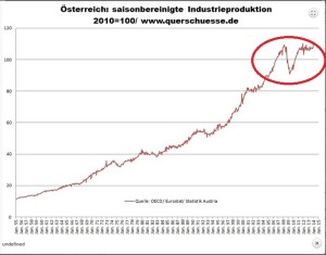
The following chart is “lifted” from the german blog Querschüsse, which specializes in long time data series. It shows austrian industrial production beginning in 1955. If you look at the tail end you can see the sudden collapse in the crisis of 2008/09, followed by a sharp recovery leading up to 2011. After that you have stagnation. The german and even the US chart looks very much the same.
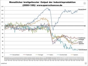
But the countries in the european south are another cup of tea. Apart from Greece their economy picked up somewhat after the slump. But beginning in 2011 their production rolled over again and this happened at the same time when the curve flattened out in germany as well. But the output gap between north and south remains large and shows no sign of becoming smaller. Today the level of real production is 15 to 30 per cent lower than it was in 2000. The chart is adjusted for inflation.

You should keep these two charts at the back of your mind. Next time you read an excited story about the european recovery you should remember them.
To conclude I want to put forward a qualifier. Official data are treacherous, especially if they are adjusted for price changes. But usually there are no alternatives.

Comments are closed, but trackbacks and pingbacks are open.